Extract from The Guardian
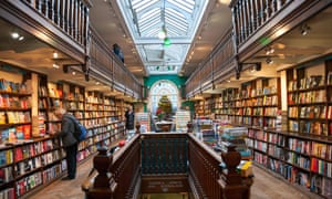
The digital revolution was expected to kill traditional publishing. But print books are ever more beautifully designed and lovingly cherishedAtmospheric: the Daunt Books branch in Marylebone, London. Photograph: Alamy Stock Photo
Alex Preston
Sunday 14 May 2017 17.00 AEST
Books have always had a fetishistic quality to them, with their dusty secretiveness. Now, though, it feels like we’re living through a special moment in the history of book design and beautiful books are everywhere.
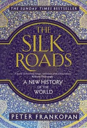
Take George Saunders’s Lincoln in the Bardo with its marmoreal endpapers or Peter Frankopan’s The Silk Roads, with its cover inspired by mosaic from the Imam mosque at Isfahan; Sarah Perry’s The Essex Serpent, its sumptuous jacket inspired by the tiles of William Morris; 4th Estate’s gorgeous repackaging of Chimamanda Ngozi Adichie’s backlist, based on vibrant African headwrap patterns; the glimmering Penguin Hardcover Classics reissue of the works of F Scott Fitzgerald, or its clothbound editions of Austen, Brontë and Dickens. It’s hard to know whether to read these books or caress them.
Book covers looked very different a decade ago when the appearance of e-readers seemed to flummox a publishing industry reeling from the financial crisis and Amazon’s rampant colonisation of the market. Publishers responded to the threat of digitisation by making physical books that were as grey and forgettable as ebooks. It was an era of flimsy paperbacks and Photoshop covers, the publishers’ lack of confidence manifest in the shonkiness of the objects they were producing.
But after reaching a peak in 2014, sales of e-readers and ebooks have slowed and hardback sales have surged. The latest figures from the Publishing Association showed ebook sales falling 17% in 2016, with an 8% rise in their physical counterparts. At the same time, publishers’ production values have soared and bookshops have begun to fill up with books with covers of jewel-like beauty, often with gorgeously textured pages. As the great American cover designer Peter Mendelsund put it to me, books have “more cloth, more foil, more embossing, page staining, sewn bindings, deckled edges”.
"Everything is aimed at
persuading people to pick things up, making bookshops a place where
you discover beautiful things"
James Daunt, chief executive of Waterstones, contends that the resurgence of the physical book is real and sustainable. Furthermore, a focus on the book as object of desire has been central to his turnaround of Waterstones. This has not only seen the firm return to profit, but has made the shops, once dim grey halls of cheap paperbacks, ziggurats of three for twos and mountains of celebrity cookbooks, things of beauty in themselves, as cleverly curated and carefully atmospheric as Daunt’s eponymous London bookshops. “A very large part of the way I sell books has been about how you present them, how you bring the customer to them and exploit the tactile sense of a physical book. We’ve changed the furniture at Waterstones to make that happen. We have smaller tables with more focused displays. Everything is aimed at persuading people to pick things up, trying to catch their eye, making bookshops a place where you discover beautiful things.”
Daunt doesn’t feel that the current vogue for beautiful books is anything new, but, rather, a return to the values that existed in a previous publishing era. After the financial crash, he says, “there was some cost-cutting and shortsighted penny-pinching that went on, trying to boost profit margins by cutting back on production values, and I think publishers realised that consumers needed a reason to go to bookshops. And that was to buy proper books with decent paper and decent design. We’ve seen a clear relationship between books that were successful and books that looked nice and had been made well. So it then became a commercial imperative to do it.”
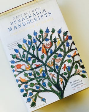
Meetings with Remarkable Manuscripts by Christopher de Hamel.
Independent bookshops are benefiting from beautiful books, too. Mary James, who runs Aldeburgh Books in Suffolk with her husband, John, says business is flourishing. She thinks we’ve now had long enough with both forms of literature to recognise that “the greyness and the blandness of Kindle” can’t compete with a book you can touch and hold: “People can’t remember what they’ve read on Kindle. Because everything looks the same. They say, ‘I’m reading this book but I can’t remember what it’s called or who it’s by.’ With a printed book the physicality and colour and texture lodge in your mind.”
Covers are enigmatic, un-pindownable things, often as much a work of creative inspiration as the books themselves. Mitzi Angel, publisher at Faber, says: “A good designer interprets the writing alongside the editor. Sometimes, a brilliant, unexpected cover can provide the publishing house with exactly the right way to conceive of a book. It can be a light-bulb moment. You think to yourself, ‘Ah! NOW I know how to publish this.’”
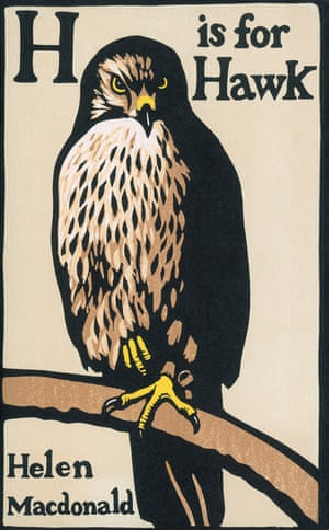
Over the time I’ve spent researching this article, I’ve surrounded myself with beautiful books, arranging them on the floor of my drawing room, looking for patterns and affinities, reluctant to put them back on the shelves, to turn those gorgeous faces from view. There were cookbooks – Polpo, Persepolis and the glorious new Great Dixter Cookbook; there were books of maps – The Atlas of Remote Islands by Judith Schalansky; The Phantom Atlas by Edward Brooke-Hitching; H Is for Hawk by Helen Macdonald. There were books whose covers relied on typography – Nikesh Shukla’s The Good Immigrant, Open City by Teju Cole, The Art of Fielding by Chad Harbach; or those whose high-concept covers burned in the mind – Ben Marcus’s The Flame Alphabet, Stuart Dybek’s The Start of Something and Colson Whitehead’s The Underground Railroad. Two recent bestsellers in particular, one fiction, one non-fiction, seemed to epitomise the beauty and sumptuous production values of this annus mirabilus for book design: The Essex Serpent andThe Silk Roads.
There’s a worry, though, that books are becoming luxury objects, status symbols, decorations rather than sources of inspiration, erudition and imaginative escape. The most cherished books on my shelves are anything but beautiful – an early hardback of The Great Gatsby with no dust jacket and “Property of the Women’s Hospital” stamped on every other page; a broken-spined New York Review of Books edition of Renata Adler’s Speedboat that has clearly been dropped in the bath. But here we must recognise that there has long been a link between beauty and learning.
Whether the physical book goes the way of the hand-illuminated manuscript, an object of merely historical interest for all its beauty, or whether this ancient piece of technology is here to stay, we should all be celebrating the work of the designers and publishers who have responded to the gauntlet thrown down by ebooks with such aplomb.
We should also recognise that the most beautiful books of the last few years have also been some of the most brilliant and inspired. The care and attention lavished on those intricately illuminated medieval volumes said something important about what was written inside them, the value of the words within, and this is no less true today.
Alex Preston’s As Kingfishers Catch Fire is published by Little, Brown in July (£25). To order a copy for £21.25 go to bookshop.theguardian.com or call 0330 333 6846. Free UK p&p over £10, online orders only. Phone orders min p&p of £1.99
Authors on their book jackets

Sarah Perry, The Essex Serpent
Publisher: Serpent’s Tail
Design: Peter Dyer
I’d been asked to send to Serpent’s Tail any images that I thought really striking, so I emailed over a dozen or so pictures of the tiles I saw at the Jackfield Tile Museum: lots of William Morris and William de Morgan and so on. I forgot about the tiles until I was emailed a proposed design. I was in the car suffering the most awful bout of hiccups, which nothing seemed to quell; when I opened the document on my phone and saw the cover design I gave such an enormous gasp of delight they stopped immediately. I knew at once it was perfect.
The design has had a huge impact on the success of the book. It’s not simply that it’s a fabulously striking and unusual design – it’s that it captures something about the book that I had tried very hard to achieve and hoped readers would encounter: both absolutely rooted in the Victorian tradition (a William Morris design, in this case) and somehow very contemporary seeming, too. If the book had had some more conventional historical fiction cover - a woman striding out over marshland, for instance - it would have misrepresented the book and I think been far less appealing to readers. And I would have been appalled!

Helen MacDonald, H Is for Hawk
Publisher: 4th Estate
Design: Chris Wormell and Suzanne Dean
The cover design came about with the kind of speed and ease that later feels like the inevitable workings of fate. There were no alternative covers. About a year before publication, my editor, Dan Franklin, wrote to me asking if I had any thoughts on a jacket image. The title reminded him of William Nicholson’s alphabet prints, he said, so rather than a photographic cover, he thought we could find an illustrator who could do it in the Nicholson style. Art director Suzanne Dean suggested Chris Wormell as a perfect fit and I was overjoyed. So I sent him a series of reference photographs of Mabel, my hawk, along with technical illustrations of falconry furniture — perches, jesses, falconry bags and so on. And nine days later I was emailed a pencilled rough of the jacket. It was perfect.

Peter Frankopan, The Silk Roads
Publisher: Bloomsbury
Design: Emma Ewbank
At first, I was sent a mock-up by a designer in the States and it had a picture of a dump truck and a Persian relief that’s 2,000 years old on it. They said: “It’s about the old and the new, you see.” I was pretty crestfallen. I sent Bloomsbury a collection of images and one of them was the inside of the Esfahan mosque. Emma Ewbank came back with her idea and when I saw a copy of it, I almost wept with happiness. It told me that Bloomsbury had really thought about it. They wrapped this wonderful purple belly band around the hardback and then the gold and silver on the cover… I knew that people would know that it wasn’t just about camels and ancient silk roads, that it was about the history of the world.


No comments:
Post a Comment